Wear neutral and solid colors
When all else fails and I cannot decide what to wear for photos I lean into neutral and solid colors. Wearing solid colors works great because it doesn’t distract from the background and really helps to focus attention on you and the beautiful scenery.
Think about your location
What colors will go with the location that you are doing your shoot at? I like to find color pallets and choose colors that complement each other as well as the location.
When in doubt – black or white
Black and white are so classic. They are trend-proof and are always flattering. If you are doing a photoshoot in a bright area with whites and creams in the background black is a great option as it really puts the focus on you and pops off of the background. That also goes for creams and whites against darker backdrops such as pine trees or in an urban setting with more distractions in the background.
Plan Mom’s outfit first
Mom should always choose what she wants to wear first and then plan the other outfits accordingly. I love finding a pretty dress or skirt and then matching colors or complementing it with what my husband and son are wearing.
Think about the season
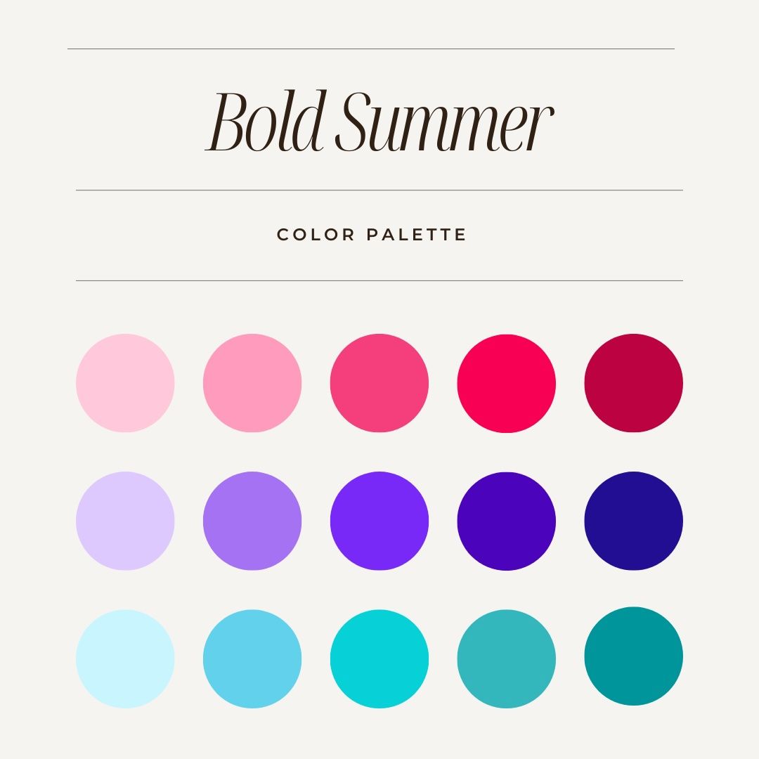
Summer
Summer colors can be bright and bold. Think green grass, green leaves and bright blue skies. One of my favorite summer colors is pink or coral. Pinks are the perfect compliment to the green colors of summer.
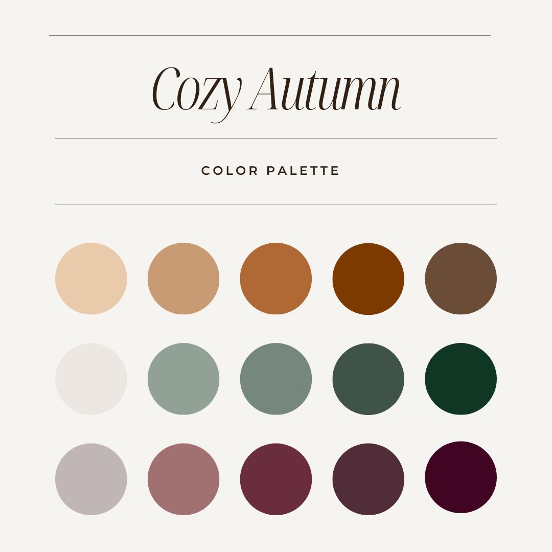
Autumn
Autumn colors are more muted tones that go well with gold and yellow leaves. I love earthy tones such as rust, burnt orange, creams, dark greens and browns.
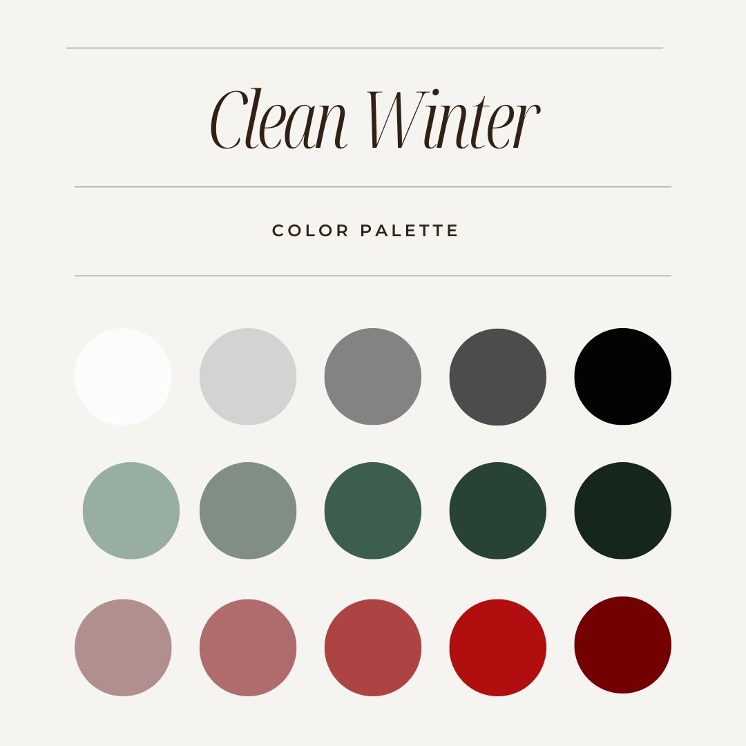
winter
Winter colors can be tricky based on weather and snow. Black and white are always safe options in the winter. I tend to avoid blue since the lighting and sky have a lot of blue tones in winter. Deep green and earth tones are good in winter. Bright red can be beautiful against white snow if you're looking for a pop.
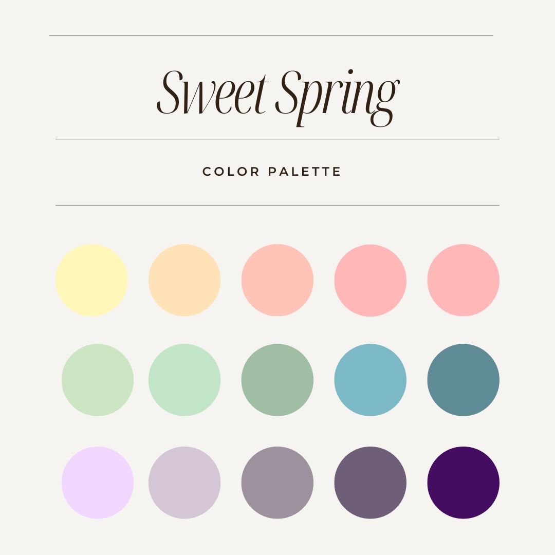
Spring
Spring colors are usually on the lighter side. Light pink, blue, lighter greens and creams are great options during the spring. Pastel yellows and purples can be a great option as well.
what to avoid
Bold and overwhelming patterns are definitely something to avoid. These patterns can detract from you and the surrounding landscape. You want the focus to be on you and your family and the beautiful landscape that you are in. Another thing to avoid is very small print patterns, stripes or plaid as these can cause chromatic abberation in the camera lens (which is just a fancy term for the weird outlines that pop up on patterns making them look like they're surrounded by neon lighting). Avoiding extremely trendy clothes is always a good idea since they usually go out of style quickly and can date your photos. Lastly, I tend to avoid overly bright neon colors as they clash with nature and are usually not flattering on skin tones.
Get comfortable
It's always a good idea to dress comfortably. Comfortable clothes are especially important with kids they can be grumpy when their clothes are uncomfortable, this can make capturing those sweet moments much harder. I also like to recommend wearing comfortable shoes or bring a pair of shoes that you can get around easily in. Colorado is a rugged place and many of the locations that I shoot at can be rocky, muddy or have a slight incline.
general rules of thumb
- When choosing outfits for you and your family try to stick to 3-4 colors. This helps keep things simple and streamlined.
- When in doubt just wear neutral colors that go with most backdrops. I always end up wearing a cream colored dress and have yet to be disappointed with the final images.
- If you do wear a pattern - make sure everyone else is in solid colors. Mixing patterns can be tricky and it is best to just avoid it in photos.
- To help keep things interesting you can always use texture. If everyone is in similar colors it can help add interest by wearing a textured sweater, dress or pants. Think cable knits, corduroy and draped fabrics.
- Lastly, remember the weather. Dress in warm clothes during the winter and cool clothes during the summer. Wool is a great winter option and linen is a lovely summer choice. In Colorado I always recommend bringing extra layers, especially for the kiddos as you never know when the weather will turn.
Hopefully these tips help you choose your outfits! If you are still in doubt - just ask. I can always give recommendations based on the location and season of the photoshoot.
